![streamline-logo-color-2025-1.png]](https://support.getstreamline.com/hs-fs/hubfs/chub_backup/streamline-logo-color-2025-1.png?height=32&name=streamline-logo-color-2025-1.png)
So you have learned how to add a Teaser to your homepage, and you're excited to make a splash. You have added a Teaser to your homepage carousel... but the image that appears is zoomed in, covered up by the title text, or just doesn't seem to fit the way you envisioned. How do you fix this?
Note: We "lock" the carousel images in place and generally focus on the middle part of the image so that it can resize and scale perfectly on every device. Images that do best tend to be:
A) higher resolution (any modern cell phone creates images that are plenty large enough)
B) are landscape in orientation (wider than they are tall)
C) have padding (buffer around the important content in the photo) such that the important parts of the image are in the middle third (more info on that below)
Try to fit your image into this template for best results!
Problem 1: Using a portrait-oriented photo
Let's say you want to add this image of Einstein to your carousel:
This photo is very tall, and your carousel is, well, not. If you try to use a photo like this in your carousel, you'll end up with some less-than-desirable results:
Einstein lost his head! That's definitely not good...
Problem 2: Image isn't focused on the "middle third"
Consider the following image of birds flying over a setting sun:
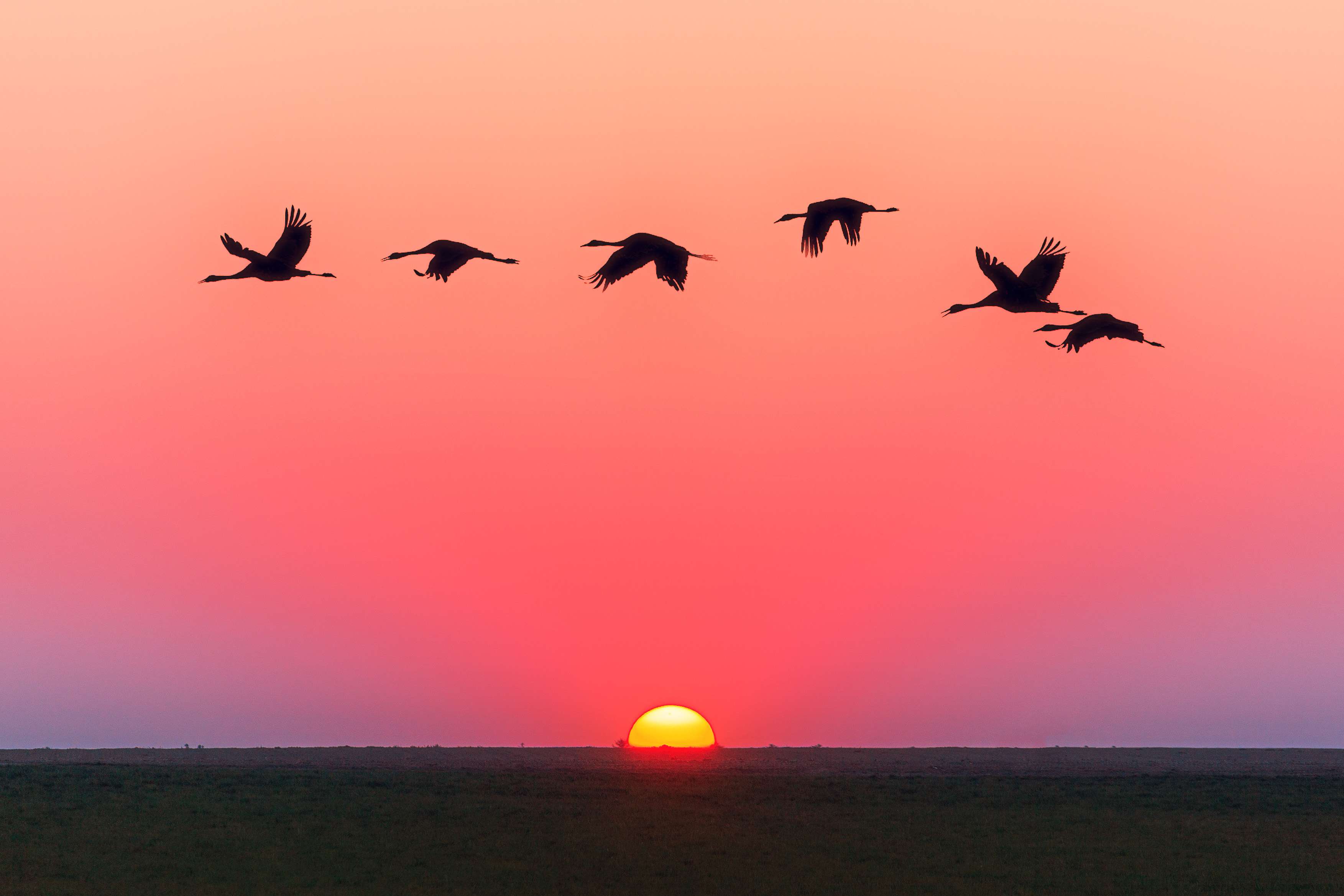
It's a beautiful image! It's wider than it is tall and high resolution. Seems like it should be a great candidate for the carousel. But if you put it into your carousel as-is, it's going to end up looking less than ideal:
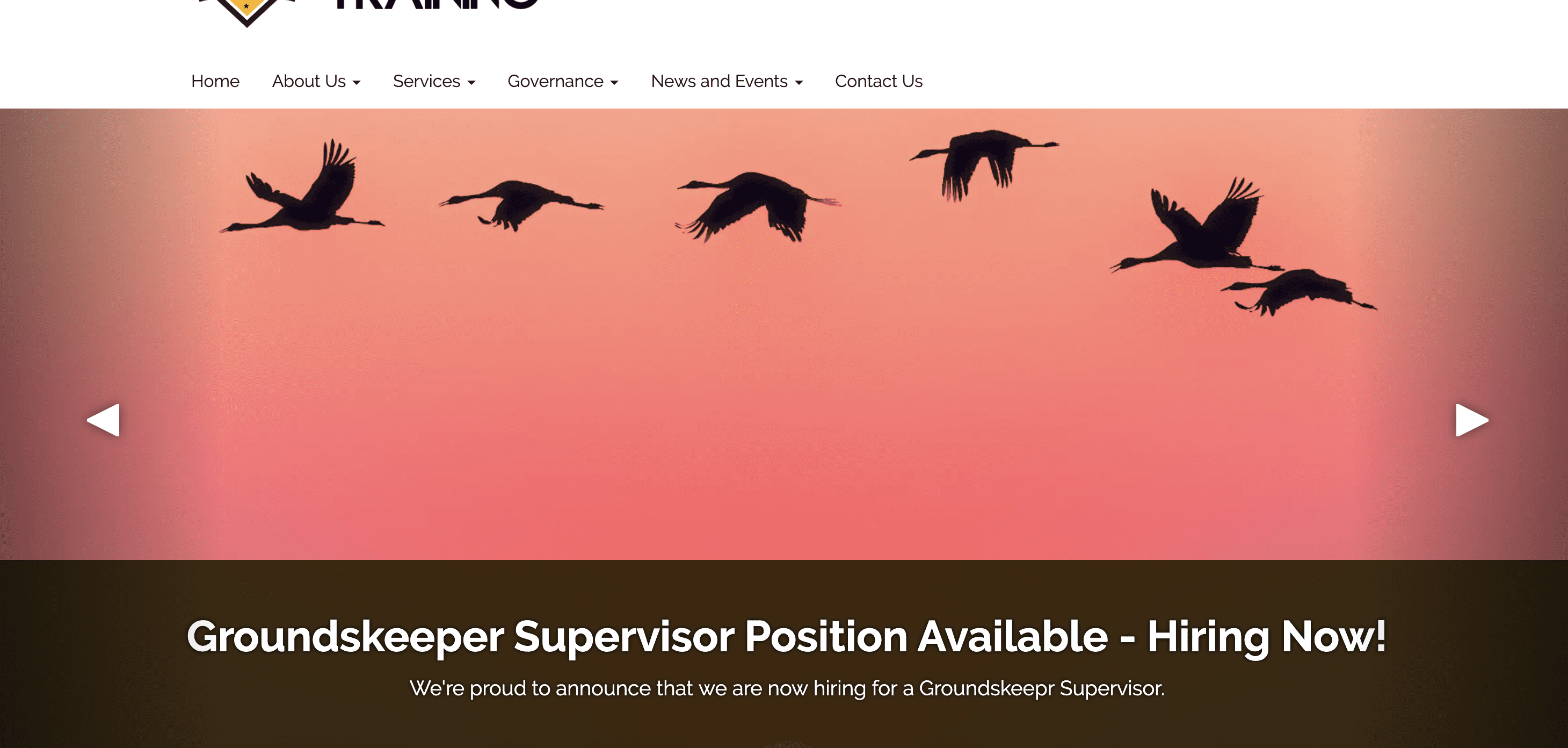
You can still see the silhouetted birds, but they're way up at the top of the carousel and you completely lose the sun. This image may not be the best to use, despite its beauty, because the important parts of the image are at the edges of the image, not in the "middle third" portion. We would recommend using something else, but if you absolutely must use an image that doesn't focus on the "middle third" then read on!
For more information on what we mean by "middle third" check out this tutorial on the "rule of thirds" in photography and design >
Tips on choosing the right images for your carousel
1. Choose high-resolution landscape images
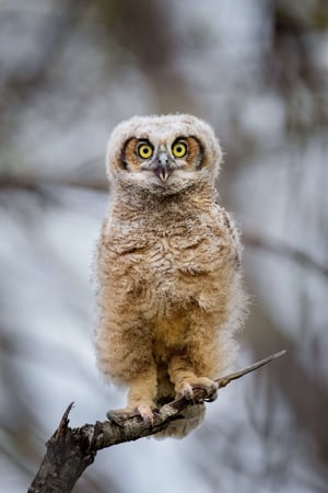
Generally, if you can replace a tall photo with a wide one, this is almost always the easiest approach and yields the best results. For example, if you replace the previous photo of Einstein for one with Fluffy here:
-1.jpg)
You end up with a much more pleasing result:
2. Add some margin space
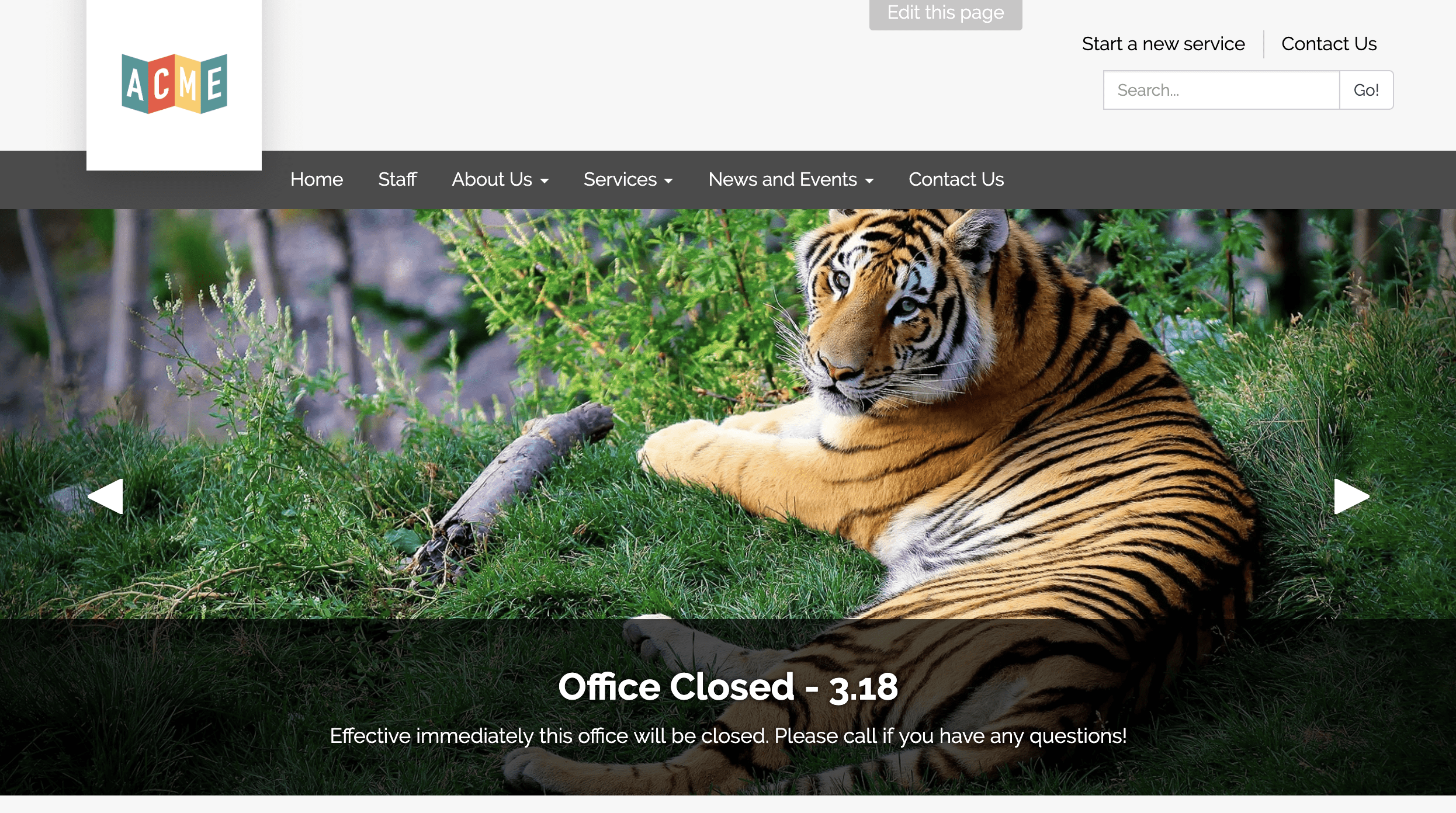
If you simply must use a specific image, you can add margin space to make the image wider, which allows for more of the image to be featured in the carousel view. Take for example a modified version of our photo of Einstein:
.jpg)
Notice the buffer area to the left and right of the image, which changes the entire orientation to landscape - this modified photo of Einstein is about 2000 pixels wide and about 1300 pixels tall (again, specific dimensions matter less than the ratio, but this is definitely "high resolution"!). If you upload this image, you'll see something more like:
You may not be a huge fan of the gray margin space. However, if the subject of the image is critical to show, as Einstein's face obviously is, then buffering the image is a solid approach.
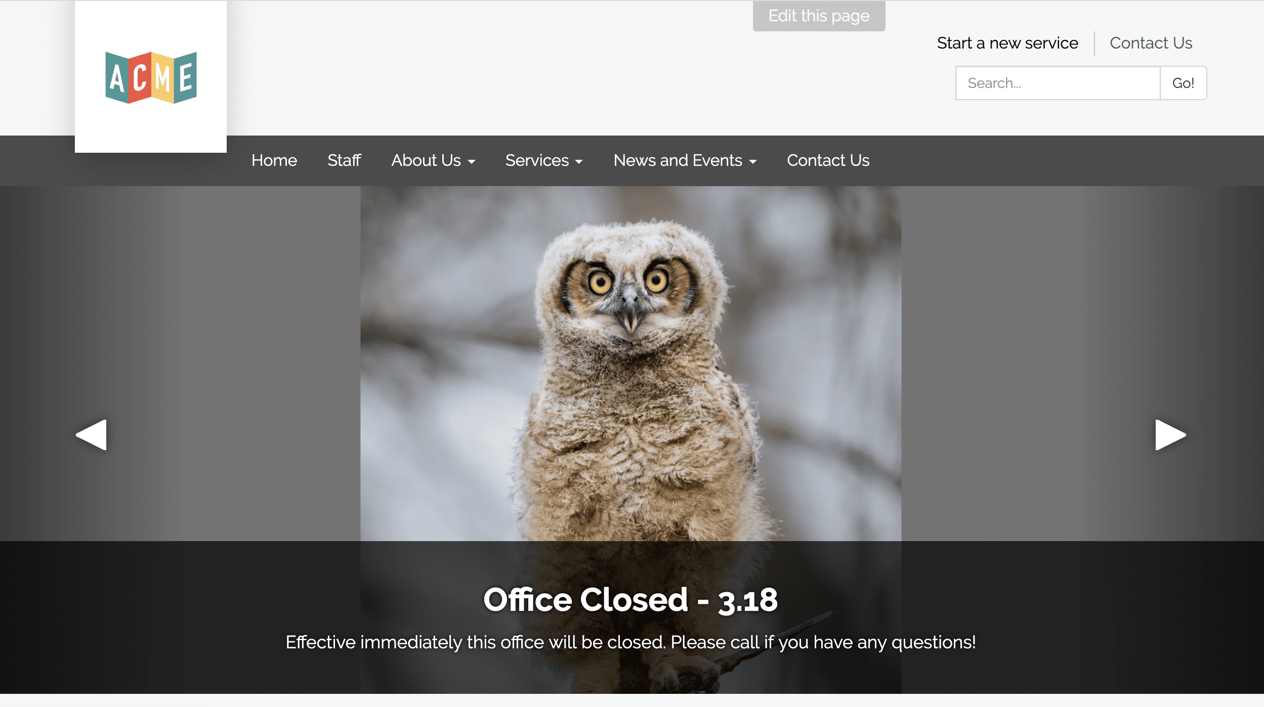
Consider too the following modified image of our flying birds:
.jpg)
This looks like a lot of added margin! But note that we're focusing more of the important part image into the middle third, with a slight shift up to account for the caption on the carousel:
%20(1).jpg)
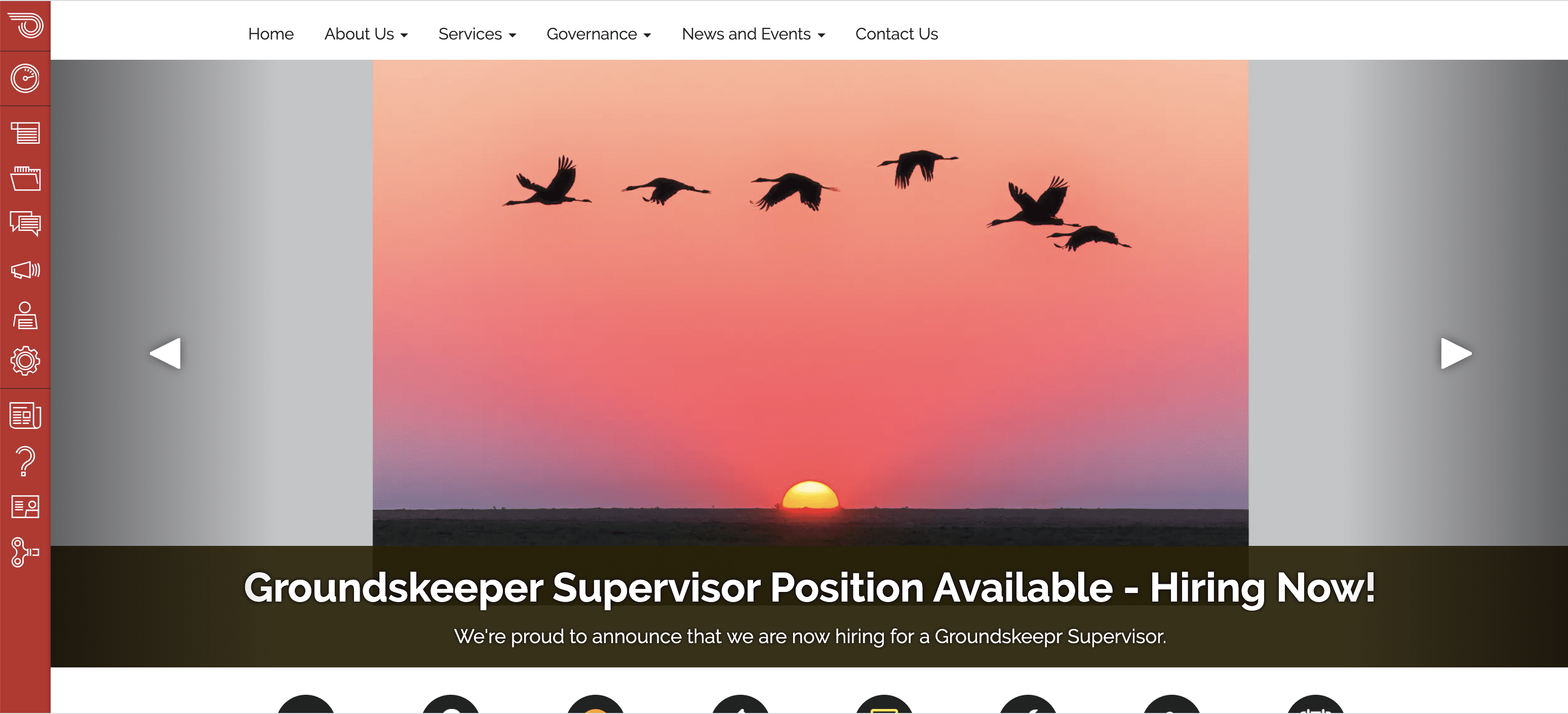
Adding the modified image into the carousel teaser displays thusly -- again, you may not be the biggest fan of this, but it's the only viable way to display this particular type of image with the important parts visible:
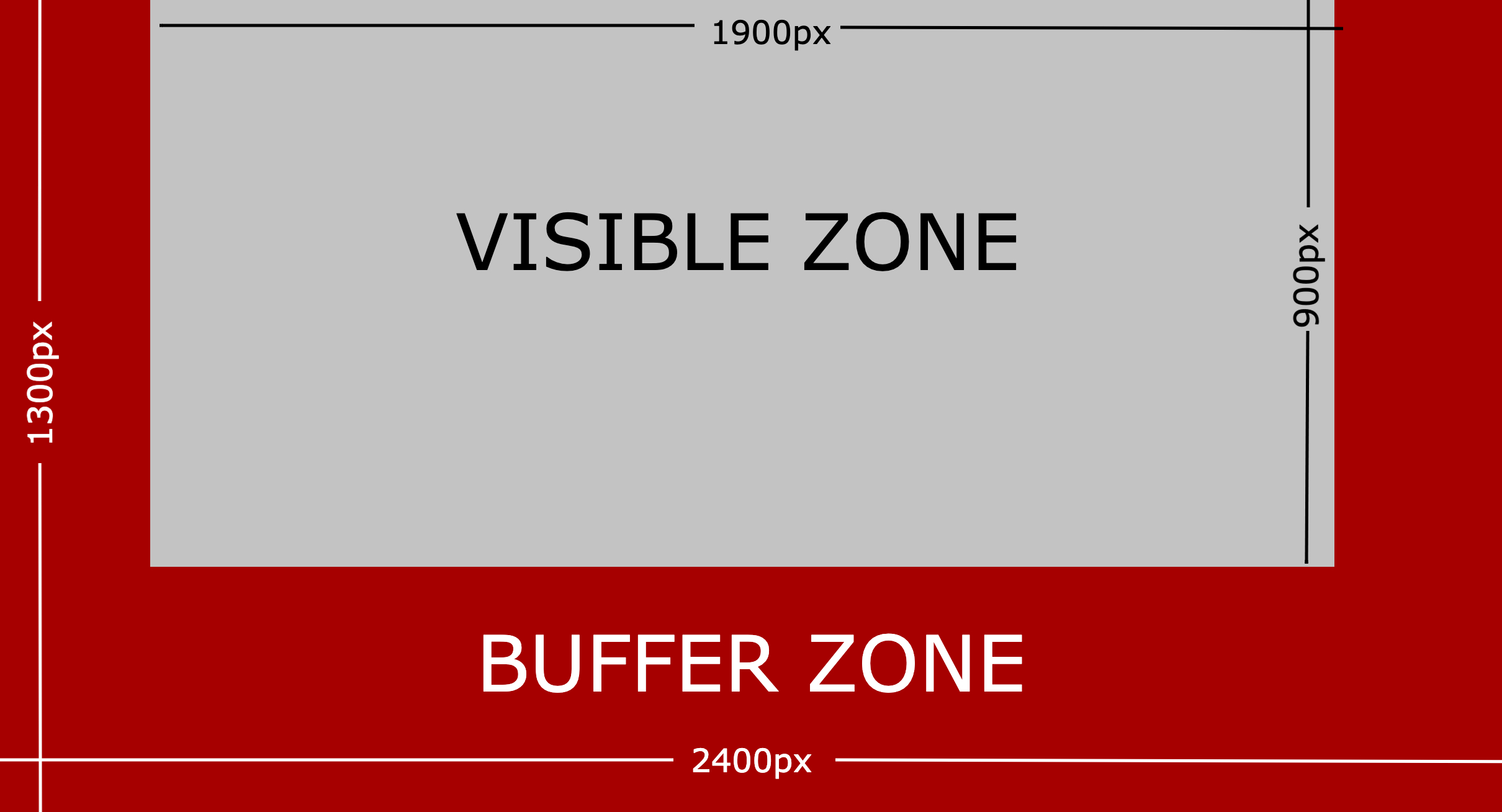
For an easy-to-follow guide for achieving the above, just use this template!
Full image is 2400px wide X 1300px tall
The "visible space" is the part of the image above the caption and inside the navigation arrows. This is roughly 1900px wide X 900px tall.

3. Use a different layout
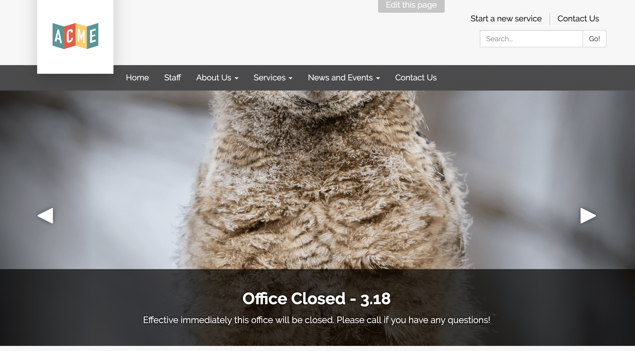
If you're running into this issue a lot, you might consider using a different layout entirely! You can navigate to your Theme customizer by logging into your site, navigating to Preferences, then to Theme. Click on the  button (the advanced section requires coding skills, this one does not!) and from here, you can preview multiple combinations of styles / feels / themes that will allow you to see your teasers in all forms, before committing to any changes:
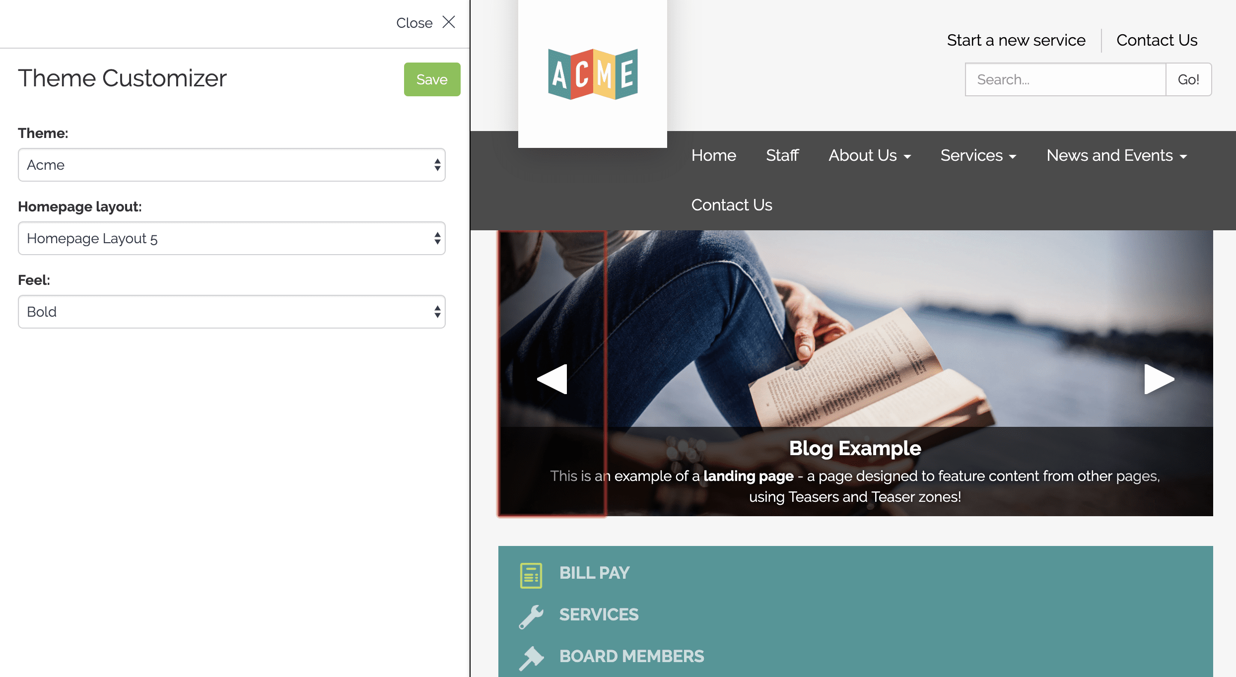
Tip: Other layouts (like 3, 4 & 5) have smaller-width carousels and are therefore more "forgiving" when it comes to using any given photo.
Additional resources
Check out the following workshop on how to build a beautiful homepage:
Still having trouble?
If you've tried and considered the above but still can't achieve what you want, reach out to us! Email us at support@getstreamline.com and let us know how we can help.