![streamline-logo-color-2025-1.png]](https://support.getstreamline.com/hs-fs/hubfs/chub_backup/streamline-logo-color-2025-1.png?height=32&name=streamline-logo-color-2025-1.png)
Last updated: December 2025
Page Preview Cards Overview
Page Preview Cards allow you to display featured pages in a clean, visual layout that helps users discover content quickly. Each card includes an image, title, and description, making this section ideal for highlighting news, services, or important information.
Page Preview Cards were formerly known as Teasers in Classic.
This article walks through how to add Page Preview Cards, choose a layout style, and customize the appearance.
Add Page Preview Cards to a Page
-
Go to your Amplify page where you want to add the section.
-
Click any blue + icon where you want to add a Designer Section.
-
Select Page Preview Cards, then click Apply.
Choose a Preview Style
Page Preview Cards offer multiple preview styles. Each style presents content slightly differently, so we recommend trying a few to see what works best for your page.
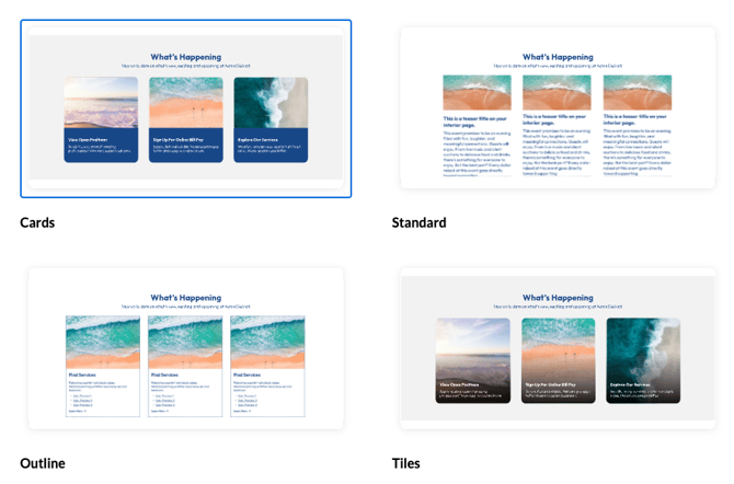
Available Preview Styles
- Cards
Shows content in a card format with text clearly separated from the image, offering a balanced and readable layout. -
Standard
The Standard style displays content in a more traditional layout and includes multiple column options. - Outline
A variation of the Standard preview style that uses an outlined design. It keeps the same page preview content, but presents each item with a clean border for a more structured, text-forward look. - Tiles
Displays image-forward tiles with text overlay. This style is great for visual storytelling or featured content.
Content Display (Columns)
For any preview style, you can choose how many previews display per row:
- 1 Column
- 2 Column
- 3 Column
Add Pages to the Preview Section
-
Click the white + icon within the Page Preview Cards section.
-
Select the page or pages you want to feature.
-
Click Save.
You can continue adding pages until the section displays the content you want.
Customize the Appearance
With each preview style, colors and styling can be adjusted within the Edit Section menu.
Section Colors
-
The Section Color controls the background and overlay colors used in the preview cards.
-
Try different color options to see how they affect readability and visual contrast.
Note: If a background image is used, the background color will change based on the Section Color selected.
Additional Section Options
Display as Accordion
You can enable Display as Accordion to collapse the previews into an expandable section.
-
When enabled, visitors can click the accordion title to expand or collapse the content.
-
An Accordion Title field appears so you can label the accordion.
-
You can also select an Accordion Color.
This option is helpful when you want to save space on the page or group content into expandable sections.
Section Title Alignment
You can control how the section title appears above the previews:
-
Left Aligned
-
Centered
This affects the section title and subtitle only.
Auto-Add Sub Preview Links
When Include Sub-Preview Links is enabled, subpage links can automatically appear beneath each preview.
This is helpful when you want visitors to quickly access related pages without adding additional links manually.
Add a Background Image
You can add a background image behind the Page Preview Cards section.
-
Enable Add a Background Image to upload or select an image.
-
You can remove the background image at any time by selecting Remove Image.
Add Padding
Padding adds extra space around the Page Preview Cards section to improve spacing and readability.
-
Enable Add Padding to increase the space around the section content.
-
This is helpful when the section feels too tight against other content on the page.
Additional Layout Options
Under Additional Layout Options, you can fine-tune the visual presentation of your Page Preview Cards.
Image Settings
Choose how preview images are displayed within each card:
-
Original
Displays the image using its original aspect ratio. -
Square
Crops images into a square format for a uniform look. -
Tall
Displays images in a vertical, portrait-style format. -
Wide
Displays images in a horizontal, landscape-style format.
These options help you control image consistency and how much emphasis images have within the previews.
Preview Appearance Settings
You can also adjust subtle visual styling for the previews:
-
Add Shadow
Adds a shadow around each preview to create more depth. -
Round Corners
Rounds the corners of each preview for a softer, more modern look.
These settings can be combined with any preview style.
Save and Preview
When you’re finished configuring your Page Preview Cards, click Save to publish and preview the section on your page.
Page Preview Cards are a great way to guide users to key content while keeping your page visually engaging and organized.
Step-by-Step Walkthrough
Use the step-by-step Scribe walkthrough to follow along to add Page Preview Cards in Amplify.
Use the step-by-step Scribe walkthrough to follow along while adding and configuring Page Preview Cards in Amplify.